What is the SharePoint App Bar?
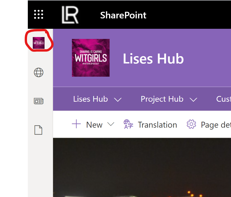
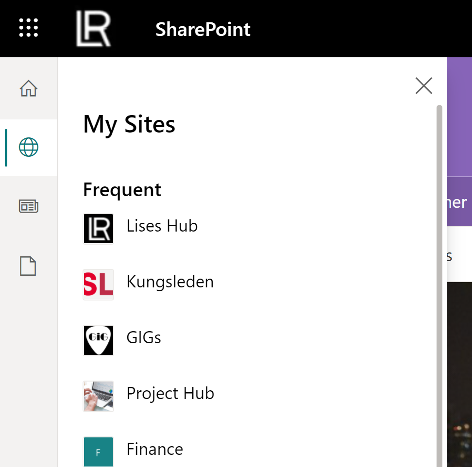
The SharePoint App Bar is a new menu that will appear* on any SharePoint online site in Microsoft 365. (NOTE that the app bar will only appear on modern sites - not classic sites). The app bar features global navigation and personalized feeds that will help users navigate, find content and resources no matter what site they visit in SharePoint. You will have the navigation and home site quickly available in the menu. It is visible on the left hand side of a site, like a small "skinny" bar. I will go through the details of it in this article. There are four tabs (buttons) in the app bar: the global navigation, sites, news, and files as shown in the images below:
*It is being rolled out to Target release now, and GA during April.
About the Global Navigation tab (the Home button)
This is the only tab that you can customize. The other three tabs in the app bar are not customizable and the content on those is enabled by the Microsoft Graph (you can see the same content by adding the web parts Sites, Recent Documents and News on a page).
On the global navigation tab you can add your company logo, title and what navigation that should be used here. Note: If you disable the global navigation then this icon will link to your personal SharePoint page where all sites that you Follow, Visited etc are displayed.
You must setup your site as a Home Site to use it as a global navigation. Make sure that all users have read access to the site, otherwise they will not see the links on the Global Navigation tab. You can use audience targeting on the links, if you want to show links only to specific people (using Groups).
How to enable and setup the Global navigation
Enable the global navigation by going to the site's Settings and Global Navigation - this is a new option on the settings menu. Note: you must be at least Site Owner to do this! Then Enable it on the toggle button:
You can add a Title and a logo, see recommended specifications below. Make sure to use a high resolution image as it will be very small and may appear blurry 😀
- The logo size should be 20x20 pixels
- PNG file type
- Transparent background recommended
Choose navigation
The last step is to determine what navigation that should be displayed on the home button.
If your home site is a hub site you have two options to choose between:
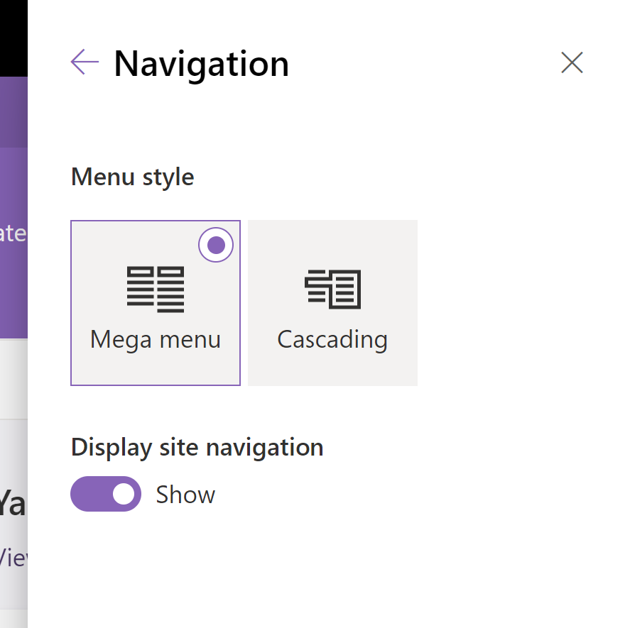
- Hub or global navigation. This is the same menu as is displayed when you enable your site as a hub site (the mega menu)
- Home Site - that is the local menu that is displayed in the site header
If the home site is not a hub site you can only choose to show the local Home site navigation:

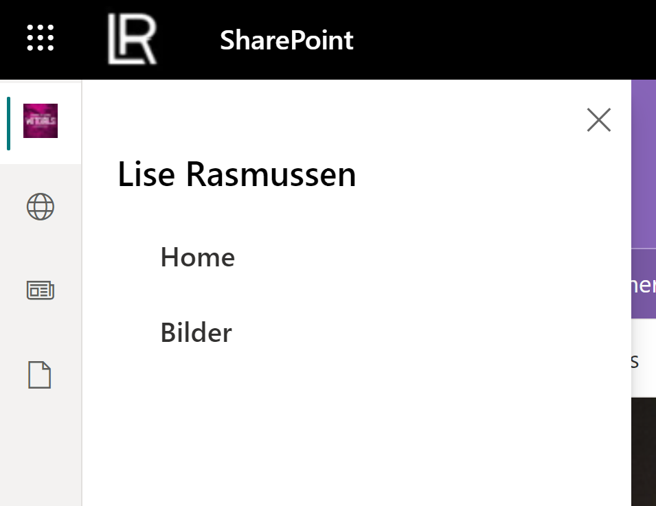
Note: If you should enable the site as a hub site later, it will inherit the navigation nodes you add here.
Add or edit links in the Global Navigation
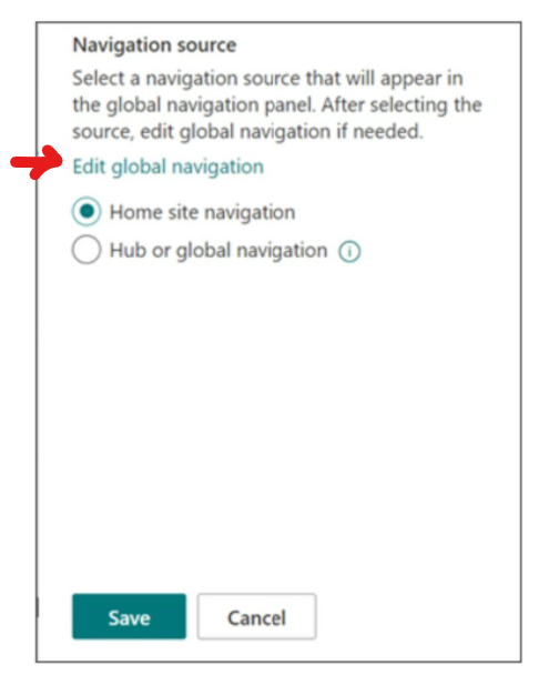
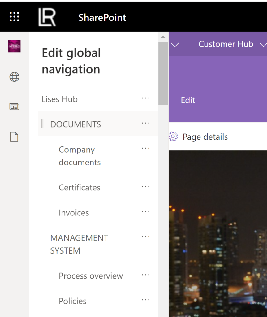
On the Global Navigation settings panel you have a link to Edit global navigation where you either create the new global navigation menu or edit the links. If you already are using the global navigation on your hub site, then the same links will appear. You edit the menu in the same way as you do on a hub site:
Different combinations with the global navigation and header
The new app bar is visible on all your SharePoint sites, no matter if they are connected to the hub site or not. If the site is connected to a hub site, then it inherits the global navigation both at the top of the site as well as in the app bar. This means that on sites that are connected to a hub there will be double global navigations, one which is the mega menu and the other on the global navigation button in the app bar:
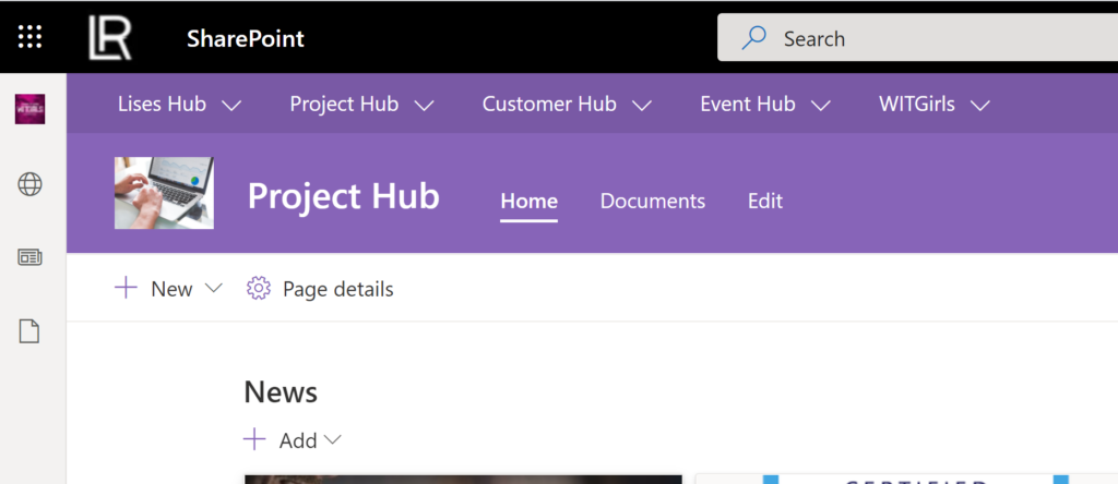
If a site is not connected to a hub site, then it will show its own Home site navigation and the app bar global navigation:
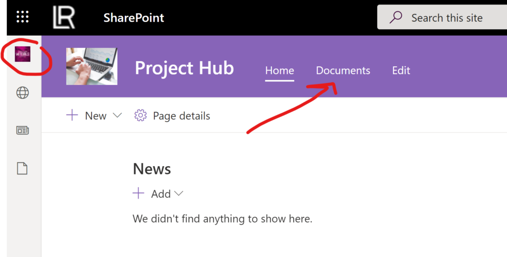
Change the header layout
You can also change how the global navigation is displayed on the site, by going to the settings of your hub site and click on "Change the look" and "Header". I am using the Extended layout, which makes the mega menu appear below the site header. It is more visible there I think, than above the header, but that is a taste thing of course 🙂
Disable or Enable the app bar
The app bar will be enabled by default, so you don't have to do anything to make it visible. But something to think about is if your SharePoint site has its own customizations, like branding or if you use the place holders for displaying messages like a VMA (important messages) etc, then this app bar can overlay those customizations. Marked in red in picture below:
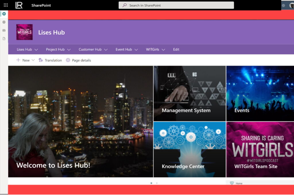
Then you can disable the app bar, but NOTE that this will only be possible until the end of October this year. So you cannot disable it forever! Disable the app bar using this PowerShell command:
Set-SPOTemporarilyDisableAppBar $true
And the opposite of course to enable it:
Set-SPOTemporarilyDisableAppBar $false
You can check the status of the app bar status with:
Get-SPOTemporarilyDisableAppBar
The Good, The Bad and the Ugly 😀
Here are my thoughts on the app bar from a design/UI perspective:
👍 The good thing with the app bar is that navigation is always present in the left hand side so that you can easily reach other sites or links and your own personal content.
👎 The bad thing with the app bar is that there will be double up menus if your home site is a hub site and you have the mega menu enabled: Then you have the same menus both at the top of your site and on the left side. The combination where a site is NOT associated to your hub site looks better, where you only show the local home site navigation and then you find the global navigation links in the app bar.
😳 The ugly part is that the app bar looks boring with its grey design and icons and it doesn't fit in on the rest of the beautiful intranet site you have setup! It should at least follow the color theme of the site or be customizable so you can add your own color and icons (the only icon you can change is the Home button).
VIVA Connections in Teams
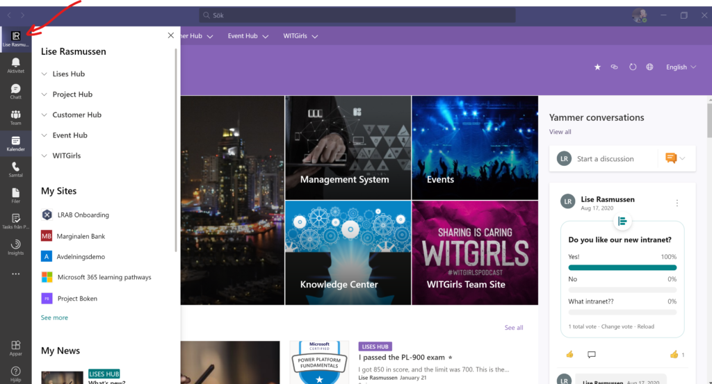
At Microsoft Ignite last year the Home site button for Microsoft Teams was announced. This button has now been integrated into VIVA Connections instead. But it will look slightly different as there will be tabs for Resources and a Dashboard etc. I will write another blog post about that very soon so stay tuned! Meanwhile you can listen to the latest podcast episode on how to setup the VIVA Connections in Teams, the result is shown in the image below:




Not finding option of Global navigation in setting icon
Hi Dolly! Thank you for your feedback. That may depend on two things: either your tenant has not gotten this functionality yet, or you don’t have permissions to edit it and that is why it’s not available on the settings menu.