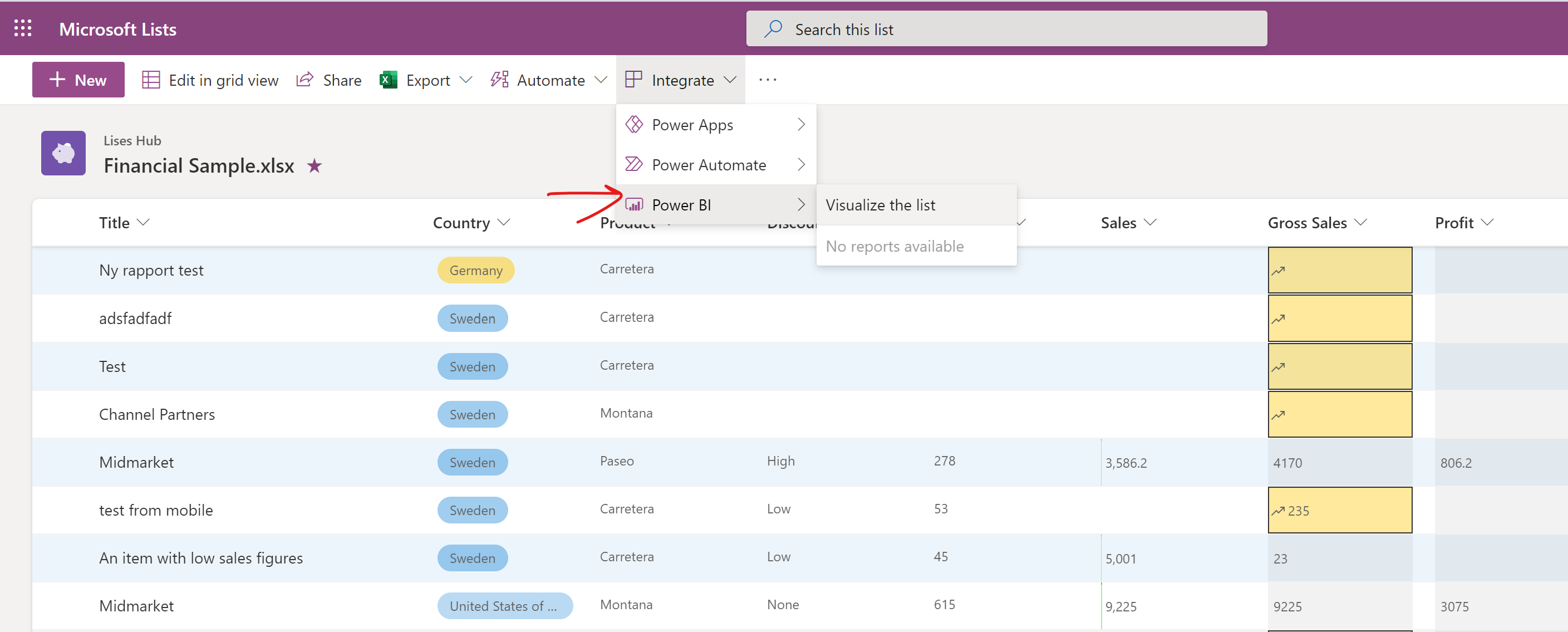
This new feature showed up recently in Microsoft 365 SharePoint lists: Visualize your lists with Power BI – straight from within the list view! 📈
A new link to Power BI will be found on the “Integrate” button in Lists, what a cool feature! 🙌 With a simple click on that button you will be taken to a Power BI report that shows your list data in graphs, without you having to do anything 😉
The new link will be added to the “Integrate” button:
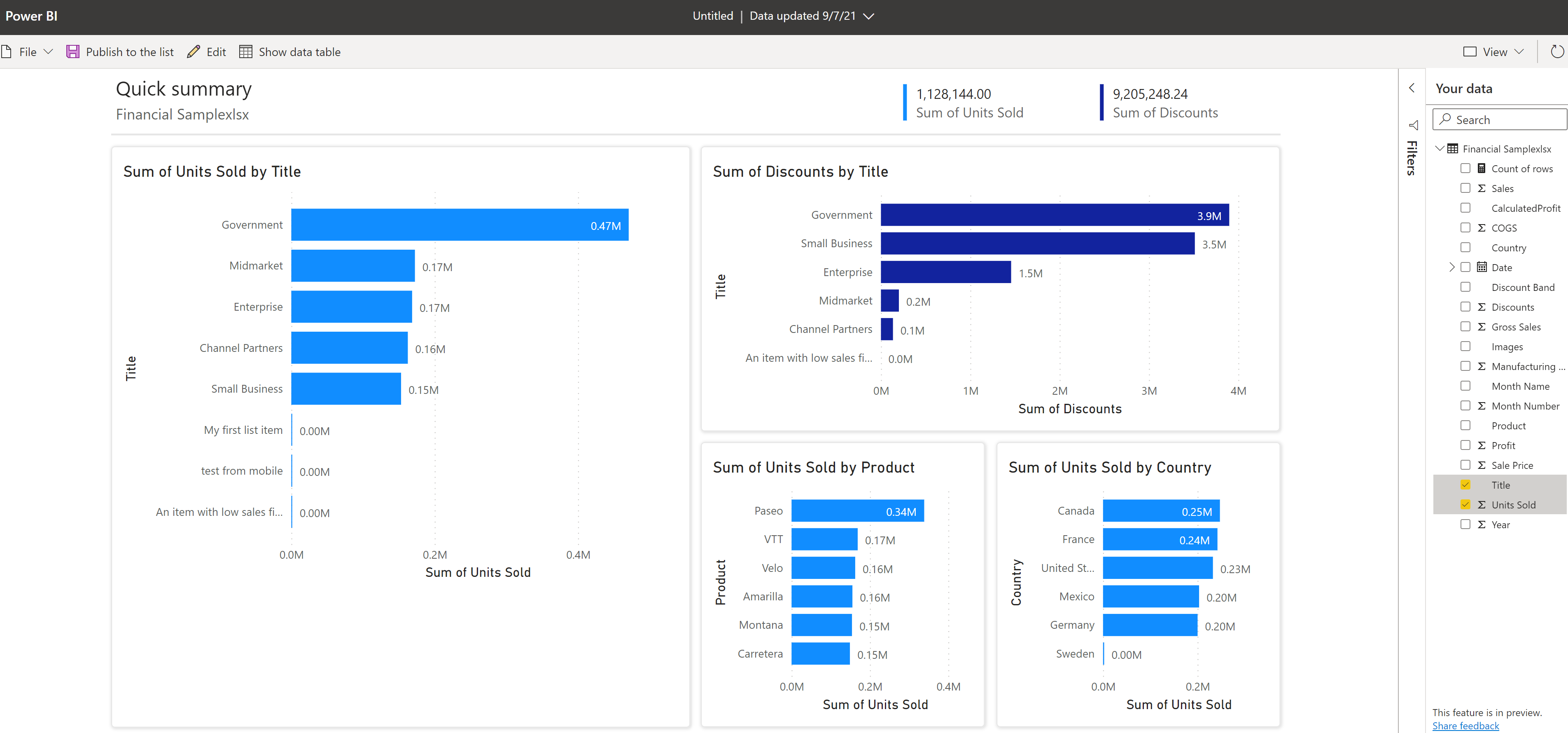
And these are the graphs that were created from my list, with two measures, shown as rows in the report, and three categories, shown as bar charts in the report. Currently you can add a maximum of three measures and four categories. Select and unselect fields to update what you want to measure and analyze. Power BI automatically adds or removes charts to show the new combinations:
Awesome! If you use Power BI Desktop, you can also create a report on a SharePoint List in Power BI Desktop.
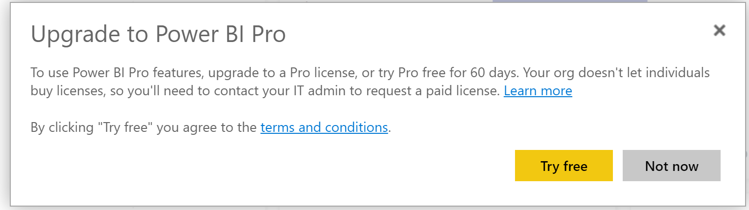
To share this report, you can click on Publish to the list button in the app bar. Then the report will be visible on the “Power BI” button in your list, but it requires a Power BI pro license (I signed up for the 60 day free trial):
If you have that, name your report and it will end up on the Integrate button:
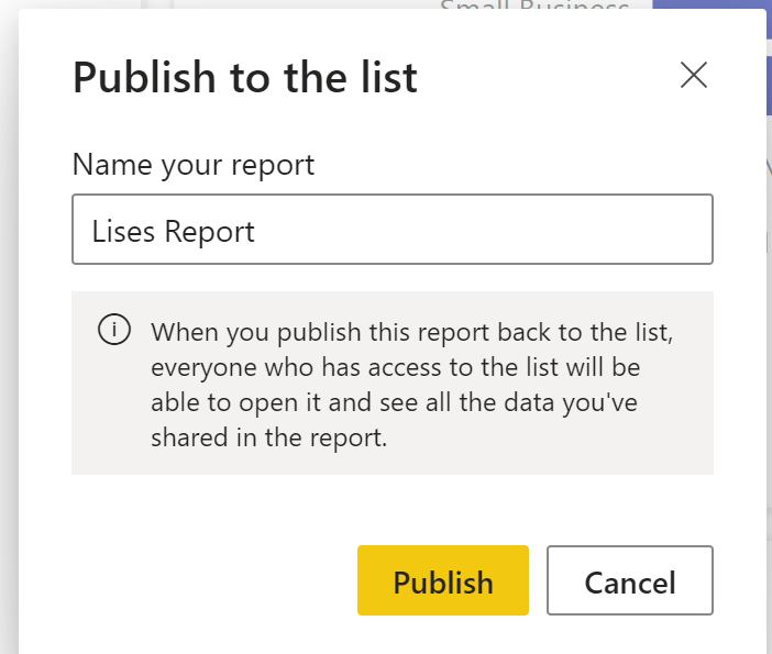
Everyone who has access to the list can now see this report! If you make changes to the report, use Publish to the list again to save your changes and the data will become visible for all users:

Super cool! But note: it depends on the license model your company is using⭐
